As part of an ongoing series, Confessions of a Cover Artist, every Friday, I’ll introduce readers to new cover artists whom I feel make exceptional covers. These artists must come highly recommended by their clients, so artists, please don’t apply to be featured. If you find an awesome artist, hold onto her/him. An artist who understands what the client needs is a true gem and can keep continuity with the author’s future books. I love the way Christine DeMaio-Rice’s incorporates texture and blends color in her covers. I was not surprised to find out she works in the fashion industry. She has a good eye for creative composition. Please give Christine a warm welcome and feel free to admire her creative artwork.
TW: Why do you design cover art? How did you first get started?
Christine: I designed my cover for Blue Valley because I thought that was what everyone did. I found I had some kind of talent when I didn’t know I had, because people started PMing me on Kindleboards asking who my artist was!
TW: What have you learned along the way?
Christine: One, I learn something new about my main tool, Photoshop, every day. Seriously, do you know how wild that application is? I can’t tell you what 60 percent of the stuff on the menu does, but every time I figure something out, I design a little better and a little faster.
TW: Oh, I totally agree about that one. I’ll accidentally come across a tool and wonder how I’d missed it before. What mistakes, if any, did you make early on when designing covers?
Christine: There were things I could have done more easily with clipping masks and other tools that I spent hours doing by hand. OMG this interview is so boring, it’s like an ad for Photoshop, and I used the phrase “clipping mask” like it was exciting to anyone but me. Let me see if I can spice up the answer to the next question.
TW: List in order, the five most important elements of a good cover.
Christine:
TW: HEY! Those sound like most of the romance covers I make.
Christine: Ok no really. Ignore the real list below because it’s boring but important
- Genre. This is a partnership between the colors, the size and type of font, and the image(s). To me, I should know what kind of book I’m buying from the cover alone. The blurb can add nuance, but the cover and title areyour biggest tools for sales because they broadcast the content.
- Nothing else is important except number 1 above, but also, customer satisfaction. If the author does not love their cover, they won’t show it all over town, and if they don’t show it all over town, the book won’t sell. Period.
- It should look like a real book. When the customer clicks on Amazon, their reaction should be nil. Nothing. They should not even notice the cover because they’ve been looking at trad pubbed books and when they come across yours it should fit in so well that there is no skip in the mind that makes them say, “this doesn’t fit in.” Which is not to say the cover shouldn’t be beautiful, but beauty is fine as long as you understand this is a marketing tool for the words under the cover, not an end unto itself.
- Font. I should be able to read it, and it should be correct for the genre. And kerned. I cannot stress enough the importance of kerning.
- Depth. This is where most authors who do their own covers fall down on the job. You’ve got the right font and the right photo, and you put those two together and think you’re done. You’re not. Or, to be more clear, you shouldn’t be. You need to add texture, and color depth, and you need to look at that font and ask yourself if it would benefit from a dropped shadow or a touch of bevel. It’s the little things, really. Look at other covers you like and see what they’ve done, and if they’ve done nothing, go look at more covers.
Christine: Illustrating a scene from the book and saying that’s what’s in the book. To be honest, if an author insists on illustrating a scene I pass them on to another designer. On a verbal level, or a structural one, your scene may indeed encompass the whole theme of the book. It doesn’t matter. Go to the bookstore and find covers that show a scene from the book. Very very few do that. It’s just not what covers are meant to do.
TW: What’s your average turn-around time for cover art?
Christine: Three days to three weeks. It depends. Right now I’m doing Lin Welch’s Whisperings series and I’m doing so much photomanipulation it’s taking forever. It was totally unexpected, but they look awesome. If someone needs a fast turnaround, I opened a premades store with inexpensive, readymade covers.
TW: What software do you use to create covers?
Christine: Adobe Photoshop CS5, Adobe Bridge, FontExplorer Pro. I occasionally have to use Illustrator but I try to avoid it. That program has moved further and further away from real logic with every update.
Christine: Mostly Shutterstock, but sometimes I have to move afield for that one special thing.
TW: Before you get started on a cover, what information do you need from the author?
Christine; Blurb and genre. If I don’t know the person, I ask for links to other covers they like. Once I have all that, if we decide to use a face on there, I send stock photos for approval first. The character’s face is very important and no one knows them like the author. This can take a wildly long time, but after that it’s pretty quick.
TW: If you suddenly lost your skilz, who would you hire to design your cover art?
Christine: This was a tough question. It would have to be someone who has infinite patience and an excellent knowledge of Photoshop, because I’m going to be over their shoulder
telling them what to do, and where I’d experiment to get what I wanted, this person would have to know what to do without the frustrating steps to get there. Honestly they wouldn’t need any visual talent at all, because their eye would just get in my way.
TW: Do you think being a novelist makes you a better cover artist? How so?
Christine: It makes me sympathetic to what the author wants, and it makes me totally customer service oriented, because I get it. I really do.
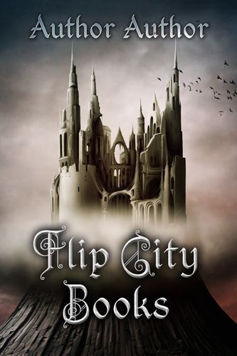
For more of Christine’s FANTASTIC cover art, LIKE FLIP CITY BOOKS on Facebook or visit her WEBSITE.
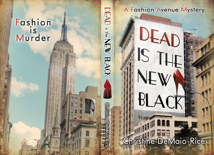
Dead is the New Black is FREE today only on Kindle!
Laura Carnegie gave up on the man of her dreams a long time ago. He’s fashion designer Jeremy St. James, and not only is he her boss, everyone knows he’s gay.
When he’s arrested for murder, secrets come to light and nothing is what it seems. If Laura can just solve this crime, keep the cops off her tail, break up a counterfeiting ring, and get the show on the runway by Friday, she might stop being Seventh Avenue’s perpetual loser.
If you love Project Runway, or enjoyed The Devil Wears Prada, try Dead Is the New Black.






May 11, 2012 at 1:52 pm
Thanks for all the great tips on making a better cover. Great info!
May 11, 2012 at 5:58 pm
Thanks for stopping by, Jolea!
Also, I just wanted to congratulate Christine for making it to the #1 spot for free books in the ENTIRE Kindle Store. Not just for a certain category, but ALL free books. Awesome! Expect sales to follow.
May 17, 2012 at 12:22 am
Reblogged this on mmromance and commented:
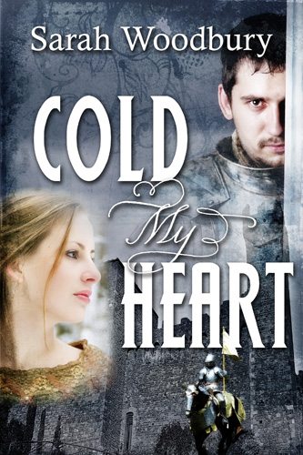
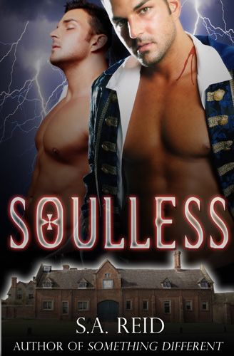
My upcoming book SOULLESS gets a mention. And check out the other covers…